Monday, April 27, 2009

Thursday, April 23, 2009

Made by typeface

Whilst at Wellcreative (the first company I interned at) I worked with a client called Made-by.

‘MADE-BY is an independent consumer label for fashion companies who continuously improve and are transparent about the social, economic and ecological conditions throughout the whole supply chain of their collections. The mission of MADE-BY is to make sustainable fashion common practice.’ “Wouldn’t it be great if you could buy your favourite brand made in a sustainable manner?”

There were various pieces that I was given to work on such as a logo design for their ‘Track and Trace’ system, which really tested me. I think I went through about 25-30 versions of the design before the choice was finally made. I almost became Track and Trace by the end of it. Unfortunately, when I left I’ve managed to lose all of my backed up files of my work there! So you will just have to take my word for it on this one…..but anyway, it was a really good logo work out and I learned a lot from it. A logo has to communicate feeling and function, not just a pretty vector image kids.

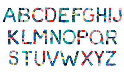
One of the more interesting bits of work was the promotional work for ‘de week duurzame mode’, which translates as ‘ the sustainable fashion week’. The designers decided to make an entire typeface using the clothes of Made-by as a kind of sustainable way of making imagery… then printed them all in newspapers and shop windows. Either way, it was really cool to work on.

I got to go to a photostudio, don a fetching white ‘Made-by’ jump suit and piece together A-Z, 1-10 etc in slow motion. It was in slow motion because the end result, as well as print, was to have a stop motion movie where the client could spell out whatever they wanted for online animations. The photographers were really cool and used cameras more expensive than top of the range cars. I stayed well clear.

IMAGES
Thats a fine looking top of a head on the dude on the right.


S is for Sean

Obsessions make my life worse and my work better


'In September 2008 Sagmeister Inc. is participating in Droog Event 2: Urban Play. The public art installation will consist of 250.000 eurocents placed on the floor, covering more than 300sqm on a square in Amsterdam (>Map). The coins will spell out the sentence “Obsessions make my life worse and my work better”. The piece is part of the series “Things I have learned in my life so far” by Stefan Sagmeister.'


I helped with this Sagmeister project, but not nearly enough as most of the people there. I put together a serif and sorted out some coins. Juuuuust enough help to brag to everyone that I worked on a sagmeister project. As much as I would have liked to have done more and really put my mark on this amazing project... placing and sorting 1 cent coins in perfectly straight lines is pretty fucking boring and the granite floor almost destroyed my knees.


Anyway, it was awesome to be part of it. There were some really cool people there to talk to (mostly designers of course) and the out come was truly impressive.

Stefan Sagmeister. What a guy.

Wednesday, April 22, 2009

Cool shit no.2


There are a couple of things ive noticed about cool little art exhibitions in Amsterdam, one being they are generally free to enter and best of all there is always free beer all night! As an Englishman, of course I only go up a respectable number of times to coyishly ask:

‘en biertje alstublieft’, DANKEVEL’

with a smile on my face that says ‘you’re really ok with me having this?’. But manners don’t seem to apply to Australians ; ), so just get them to get the liquid drugs!

Anyway, I went to an exhibition with Dolly Rogers called BANG YOUR DEAD. Cool name, Cooler exhibition.

The exhibition looked at war and how it effects young children ( or something to that effect), which manifested itself into huge wooden knife/grenade toys, camouflage jigsaws and ninja star pillows made from ex army blankets. It was all right up my street, guns, pillows,knives, beer and a dj pumping out some near decent tunes. What more can a 22 year old boy ask for?

Heres some images for your eyes:


This was cool. It was a 3d dove made from strings with little ninja stars attached to them that hung from the ceiling. It was about the size of a horse if you can't gather what size it is from the images...


Wooden weapon toy block thing. You've all seen/had them...

The pillows made for great landing pads. Check the air on that shit! me and Rogers made sure it was safe for others.


And of course, you can't have all these pillows round, feed everyone alcohol and not expect a pillow fight.

Thursday, April 2, 2009

The idea of the working world is such a scary one when you're student. With all the abstract names, cool websites and the top work that’s displayed in Grafik and Creative Review etc, it is easy to forget that the people behind these big ideas and companies are just exactly that, people.

What scared me the most was the fact that I had it in my head that they would all be Uber design Warriors (which most of them are), stressing out about huge deadlines and scalding the intern with their coffee whilst pushing their face into a scanner for not cutting a mock up straight. I also thought, that working as an intern will be fiiiine, its not like ill be given any work that will actually mean anything to the company.

Well, I was wrong on both counts. Firstly, the people are lovely. Secondly, people employ interns to help them, they don’t do it out of the goodness of their hearts. They want someone who has the passion and drive to create work and learn from them at very little cost. If an intern is no actual use to the company as far as producing work then it would be a waste of their time and probably money.

I have had work that includes logo design, Photography (see previous post), Website design, magazine layouts, package design and presentation work. All of which I have learned a lot from by doing them with the support of colleagues who know all the shortcuts and can give critical advice that makes sense! I generally don’t learn when its my own work because I think I know what’s best for my work, but when its someone else’s work on the line, you listen and you learn because if you don’t its not just a couple of marks you’re missing out on, its letting down a whole company and probably people you have come to like a lot.


So, that’s why I say you learn way more, because your work actually matters now.

I can’t really remember what I set out to achieve with this post, but I’m sure what I’ve written isn’t the original idea….

I guess the moral of the story is get a fucking placement and prepare yourself for some hard work, a knowledge-fest and good times!

Wednesday, April 1, 2009

PS : Nothing wins over top Amsterdam creative’s

After Nothing came out and grabbed a shit load of media coverage, the effect was immediately apparent because not long after the website went live, a call came through from Het Parool informing us that they are setting up a competition to design the front cover of the PS magazine as part of their 10th anniversary celebration,and we were invited to design. The companies involved included Kessels Kramer, They, 180 Amsterdam and many more.

Het Parool is a newspaper in Amsterdam, which, I suppose is similar to the Guardian as far as content is concerned, not aesthetically of course. But they do have all the supplements and what not, and one of the supplements is ‘PS’, which gives you all the best places to eat, drink, party and also the movie and music reviews etc etc etc.

To take all of the credit would be a complete lie, because I did very little apart from take the photograph, however, it was the photograph that beat the rest. The idea stems from thousands of bollards that protect pedestrians from cars (and destroy the wheels of cyclists), which are scattered all over Amsterdam and are instantly recognisable to all Dutch people. They carry the 3 Xs, which is taken from the Amsterdam coat of arms. Anyway, if I have to explain why we took this image then I guess its not a good idea after all…….just a prize winning one.

Thank you placement year