Thursday, November 5, 2009

FINISHED


No particular order. You will see a piece Ihavent put up yet which is the LSTN final piece.As you can barely tell what it is from that pic, heres the digital image:


Next up is entering the YCN competition.

http://www.ycnonline.com/

Thanks to Kyle Shrives for sorting me out with some sweet photographs.

Tuesday, November 3, 2009

LSTN #3

For the final 2 weeks of this 5 week project we have been set a task to design a webspage for one of Urban Outfitter's side projects.

The side project is called LSTN and showcases the latest in cool music that you should be listening to.... kinda made me realise how uncool I am right now. Anyway, check out what Rob Loeber has already come up with to see exactly what im talking about.

http://lstn.urbanoutfitters.com/

There were three factors which made this project harder than the rest:

1. We were given 2 weeks to produce the artwork, which for students means go to tvshack.net for 5 days straight before even thinking about ideas for work.

2. It was Halloween and I also has a visit from my brother, which meant two unavoidable nights out.....unavoidable.....you know what I mean.

3. There were 20 tracks on offer

The last on the list there, to me, meant thinking of an idea that would be able to stretch across 20 different artists. This made me hesitant to rush into an idea because I didnt want to spend loads of time on designing a concept and it ending up looking crappy, therefore putting me further behind. So, I made an effort to write down ideas and nail something before starting.

My initial idea was to use the jigsaw as inspiration for design for the following reasons:

1. from my research I found that the kind of people that like these bands like their design to be nostalgic and retro, cool and geeky.

2. I like how each piece is individual but comes together to make a whole

I wasnt really impressed with how the designs were coming out, and a lecturer of mine said that jigsaw pieces were a big no no in graphic design. So, I changed it up.

In short I thought about what I can get for free just like LSTN, and realised you dont get anything good for free. Which makes LSTN pretty good. So, to emphasise this point, I collected all the free stuff I could get, which ended up being all things from restaurants and cafes etc......pretty much condiments. But it really caught my imagination and each sachet or packet started to become it own individual piece.

Im really tired after today and need my sleep for 2moro. Heres the final outcome of the condiments...


Ill post the final later. Gotta sleep.

Sunday, October 25, 2009

Week 3.2

Did some more work for this week, not sure if its better or worse than my previous designs......I seem to find that as soon as I start a new piece of work I no longer like the old pieces, well not dislike, just kinda lose interest in them. That normal? I dunno.

I find my self doing certain things over and over when working and these things are:

1. Using the same safe fonts over and over
2. Using Live Trace quite alot
3. Scanning through the layer effects
4. Duplicating shit if I get stuck
5. Using the same texture...
6. using long, thin canvas's

I dont know whether this is just the culmination of all the skills ive learnt coming together to showcase my vast knowledge of graphic design or just being lazy with things that I know will look cool and save me having to put in more that a couple of hours on a piece. This is something thats been bugging me quite alot recently....

Anyway, heres the work ive done which will probably take up most of my blog because they are so long. Oh yeah, I exhausted all my ideas for 'new stock on the block', so ive got some new ones in there.


Not too bad actually.

Night night.

xx

Tuesday, October 20, 2009

Week 3 at Uni

The title for this weeks brief is completely in our hands but has to communicate something in the area of 'New Line' or ' Just in' etc. After, asking my genius girlfriend (she really is), what she thought would be a good tagline for this project she replied.

"New Stock......NEW STOCK ON THE BLOCK"

After pissing myself for a second I realised this is a perfect tagline for the target audience of Urban Outfitters, something funny coupled with cool imagery = Urban Outfitters consumer eye catcher. I started work straight away on a few sketchy ideas before we got a crit from our lecturer.

I liked the sketchy look from the felt tips and the colours worked well, so as the quick fixes worked out quite well last week I thought i'd try it again and scanned it in. I played around with the cubes and put them into patterns and brushes etc and it had a really cool effects. I have a couple here :


I really want to use the brush I used more effectively, but at the moment all I have is poor attempts at drawing octupuses. I guess ill put something up if I make something pretty, failing that i'll put the octopus up for comic relief. ANYWAY, check out these two beautys that i've been working on today!


This robot here was made from those shitty cubes I drew on the first image.....I think it worked out rather well.


My work was mentioned as one of the pieces that stood out to the Urban Outfitters member of staff last week, which is awesome! However, I do know rob (the guy who set the brief) fairly well so this could have had something to do with it..... didnt stop me from feeling dead smug though.

Hope you like the work thats pouring out of me recently, maybe ill try and get some comment thing working to get some feedbk......

Friday, October 16, 2009

Work has begun in my final year of study. Since being away, the course has changed around alot with lecturers shifting places and a new regime implemented having an awesome effect. The lecturers are excited to bring in new,fresh and inspirational briefs and have kicked it off nicely with a brief from a former student of my course at Huddersfield, who now works for URBAN OUTFITTERS EUROPE.

www.loeber.co.uk

We have been set 1 week briefs to complete imagery for all the people on their mailing list to alert them of the offers......on offer. The first week was for 'FREE SHIPPING', but I had flu that week and am embarrassed by the work......here it is anyway I guess


The second of which I am at the 'work inprogress' stage is '20% OFF', and its going considerabley better....I think.


This shouldnt be this colour..... I dont know why this happened.(above)


So this is the fruits of my labour up to this point and they have all been "quick fixes" really. I hope to put so hard work into one piece over the weekend to soothe my conscience.

Wednesday, October 14, 2009

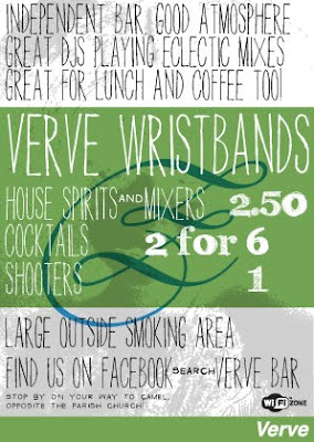
Flyer done at short notice for the bar I now work at 'VERVE', check out the offers then come get a delicious mojito served by yours truly


Saturday, August 1, 2009

The London Police

So, I finish work, braved a monumental rainfall and went to meet my girlfriend Katie and her friends in a bar. After a bit of social time it came out that they had their own art gallery/space for exhibitions

Of course...

Anyway, it just so happened that they were in the process of setting it all up and were having previews of the artist showing at that time. I had no idea from the name who these artists were and so just took it as being able to go see some art and most likely get a beer out of it, if it follows the usual Amsterdam art show fashion. However, I had an idea of who it MIGHT be from an explanation from Jamie that went a little summet like


" really clean graphic, smiley face type characters. Its pretty hard to avoid them. They pop up all over the world"

Turns out I did know them, and they DO get everywhere even my dear Stoke-on-Trent. Anyway heres some pictures from my girlfriend Katie.


Most people will probably have seen these guys work scattered about, if they have been to stoke, I cant imagine there are many places that havent got their hands on. HOWEVER, you may not have seen their canvas pieces. They are SO MUCH COOLER. The London Police are comprised of two guys who have completely contrasting styles, one of which you generally dont get to see which I think is a great shame because the work is truly amazing.


Katie looking cuter than a bunny in shoes.


This was a wall of photographs taken every 15 minutes for a day, or something along those lines by each of the artists on Queens Day ( ill blog what that is another time). Pretty impressive.


As I was saying, the art you dont get to see if you catch their work on the street is the amazingly detailed and techical work of Bob. The depth of scale that he brings into the pieces in contrast to the strong character designs truly lets you get lost in the pieces. I was lucky enough to meet Bob and have a beer with him, and he was genuinely a nice guy who had all the time in the world to let me ask all about his work and get a photo.


Its amazing how much respect you have for an artist after you meet them. Im sure whenever I see their work again I will reel off this exact blog post and bum them and myself.